Design Moments That Are Often Overlooked
The difference between good design and great design always lies in the small, but important details that truly transform a space. It’s what makes a house feel like a home, what gives a kitchen its heartbeat, what transforms a bedroom into a sanctuary.
From adding a sconce to a barren hallway wall, to mastering the dynamic juxtaposition of elements on a bookshelf, or layering the perfect textiles that complete a comfy reading nook – these are the subtle, yet notable details that linger in your memory. So, even in the most beautifully designed rooms, missing one of these tiny elements can make the room fall flat.
In this guide, I’m pulling back the curtain on some of my favorite design moments that are often overlooked.
Re-Think Your Relationship with Wallcoverings
Every rule you think you know about wallcoverings – toss them out the window. Get creative with your use of wallpapers, fabrics, textiles, and paint finishes to add texture and dimension to your living spaces in unexpected ways.
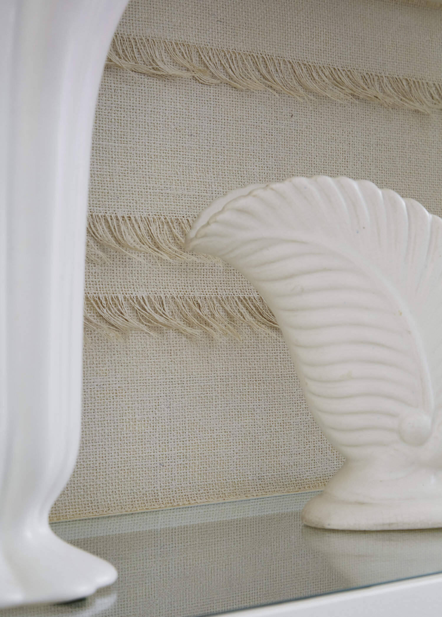
One of my favorite ways to add interest to a room using textiles (which I recently shared with Oprah Magazine!) is by incorporating it into a bookshelf. For example, in the above, I used a custom wallcovering made of burlap by a local artist to line the back of the built-in. Even though the covering is neutral in color, the texture adds a unique dimension and gives personality to the bookshelf design.
If you’re looking to keep it simple with wallcoverings, and a sprawling wall of print feels a bit too bold for you, try framing a single wallpaper panel. This concept is especially fun with a gorgeous section of hand-painted wallpaper – and it’s a great budget-friendly hack when securing enough to cover the whole room is not in the cards. Think of it as a one-of-a-kind piece of artwork, perfectly tailored to your space.
Another design area that is often overlooked but has powerful potential: turn your attention towards the ceiling. Consider using wallpaper, a bold statement color, or a lacquered paint to cover the ceiling for an alternative technique to a simple, flat white ceiling.
I encourage you to have fun with your wallcoverings — break the rules, and let your creativity run wild!
Carefully Curate Your Bedroom Retreat
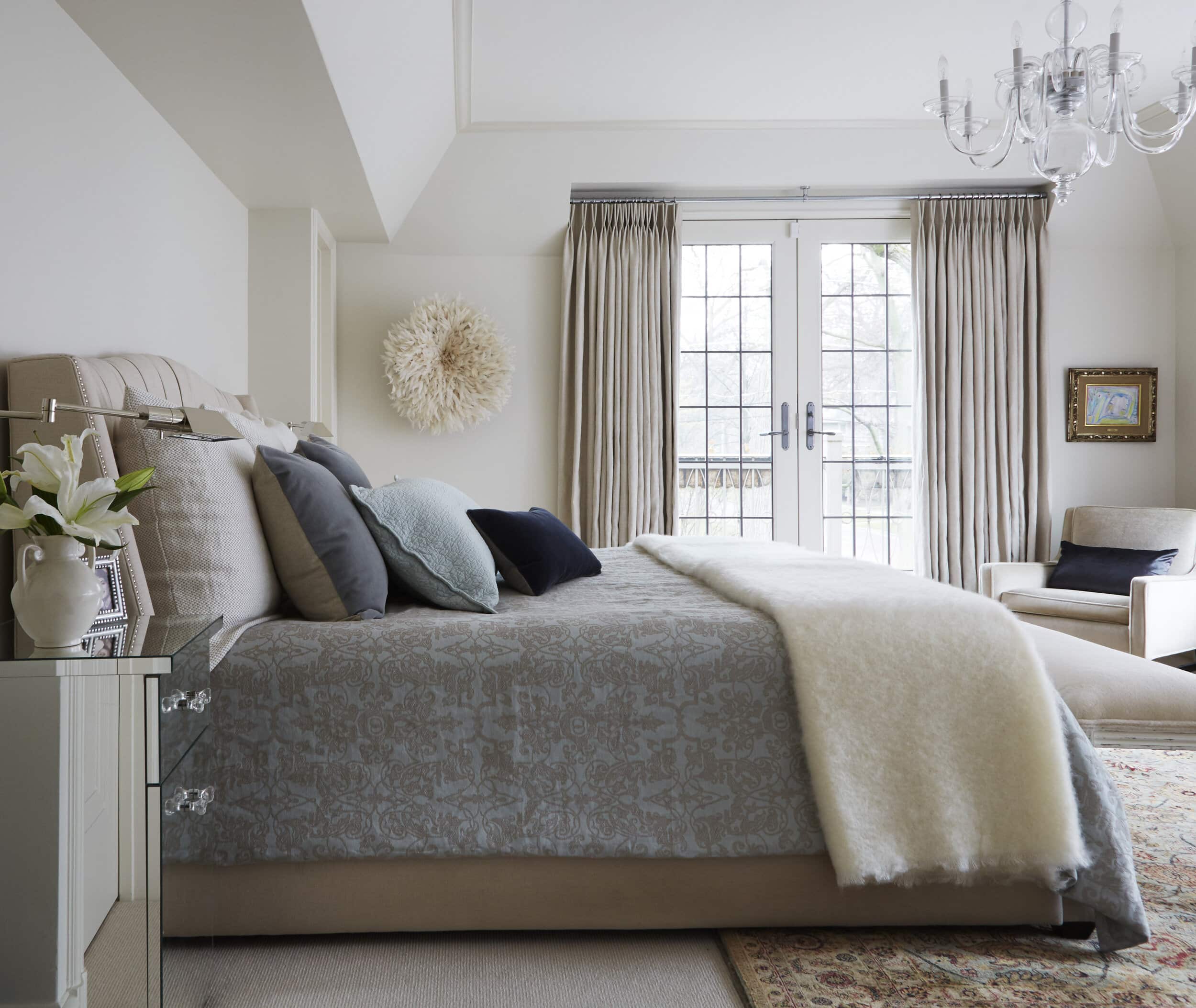
My philosophy is that the bedroom should be a place of total refuge and peace from everything going on in the outside world. I love designing dreamy bedrooms for our AKD clients, and I always love sharing my insights with you, too. And that starts with investing in pieces that are specifically tailored to your space and leave the room feeling organized, balanced, and inviting.
I always recommend investing in your bedding and linens. We spend one-third of our lives in our bed, so it’s an area where it definitely makes sense to splurge. An inviting bed with crisp linens is bound to not only elevate your room’s design, but it’s proven to improve the quality of your sleep.
Next: find the perfect nightstand. Aesthetics are important, yes. But, I’d argue that function — especially storage — takes priority here. It’s easy to let clutter pile up when there isn’t adequate storage space, which can be a quick way to ruin your relaxation. In fact, one of my favorite small design features is a nightstand that includes a built-in charger as part of the design which both hides the cords and keeps them from becoming tangled. Double win!
Lastly, in most bedroom set-ups, I find an often overlooked design element is scale. Depending on the size of your bed, identifying the right ratio between the negative space and other furniture will preserve the zen in your bedroom retreat. When planning the layout, give careful thought to which wall the bed will align with to ensure ample space for the rest of your pieces.
Plan Your Kitchen with Function in Mind
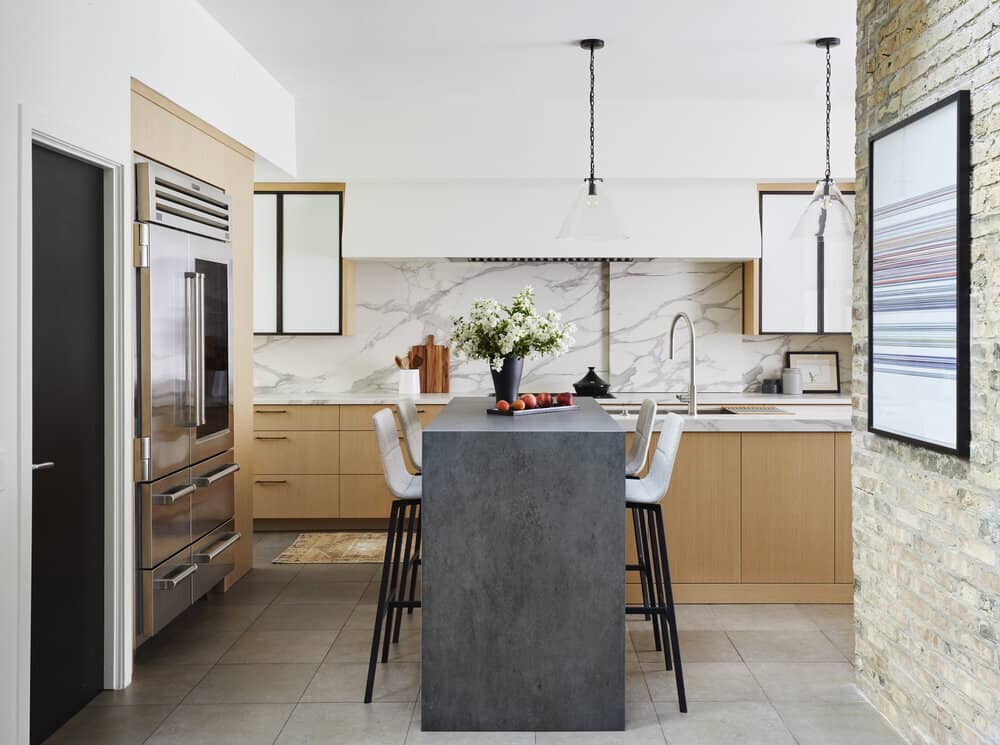
When planning the perfect kitchen, a killer design may grab your attention, but functionality will capture your soul – and make your day-to-day a whole lot easier. After all, the kitchen is a workspace where flow and amenities should take priority when thinking about the design.
My obsession with lighting doesn’t stop with the kitchen – it should always have ample amounts of layered lighting. As a critical juncture in the house, it’s important to make sure these three levels of lighting are covered: counter lighting, ceiling lighting, and focal point lighting. In addition to being a vital component for the workability of the space, stunning light fixtures tend to take a leading role in the look and feel of the kitchen.
Another must-have is a proper work triangle. This basic rule of design would be hard to overlook for very long since you would constantly find yourself bumping into your surroundings as you move around the room. When thinking about your floor plan, make sure nothing blocks the movement between the stovetop range, sink, and refrigerator to navigate your prep area with ease.
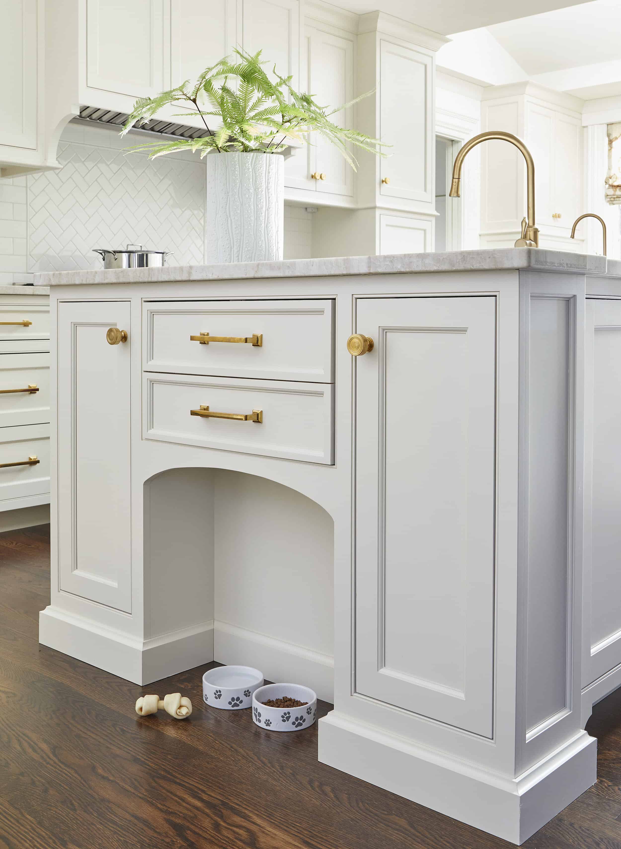
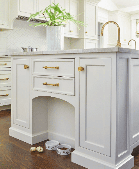
While you think about how your own family moves about this space, don’t forget to give thought to your family pets’ needs as well (one of my top #AKDDesignTips for 2020!). Factor in a place for their food, along with space for storage, when thinking about your kitchen’s ideal layout.
amy kartheiser design
home
about
services
portfolio
press
contact
Copyright © 2026 Amy Kartheiser Design | Website design by the la.rue creative studio