Perfect Pairs: Design Edition
Let’s talk design soul mates.
In the interior design world, we often speak about having a ‘signature look’ that ties together the elements of a room. For some that means that they gravitate towards a certain color, while another may flock towards pieces from a certain era. While certain styles stand out on their own, I often find that the most exciting designs come from bringing two unique design elements together.
With Valentine’s Day just around the corner, I thought it would be fun to shake it up a bit with a love note to my favorite design duos. As you look for inspiration ahead of spring refreshes, consider trying these meant-to-be pairs that I love using across my own designs.
Metal and Wood
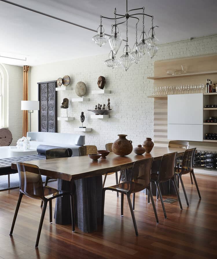
For an organic look, contrast your favorite wood pieces with metal. I love the feeling the natural, delicate patterns found in a live-edge dining room table bring when paired with cooler, metal chairs. The contrast is a show-stopper, and both materials just get better over time, as they tend to patina in tandem.
Masculine and Feminine
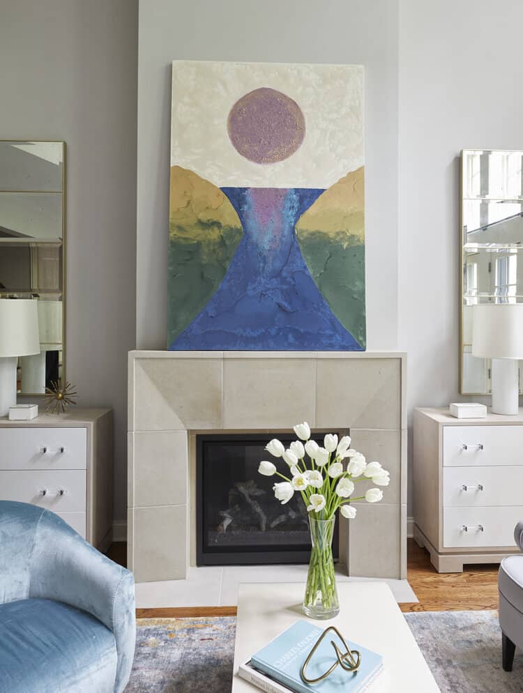
You know what they say: “it is possible to have too much of a good thing,” which is why striking the perfect balance between masculine lines and feminine curves is key to creating a harmonious space. A curved mohair chair set beside a stately sofa is one of my favorite ways to soften the more dominant statement pieces that really anchor a room. Though shapes and lines aren’t the only ways to master masculine versus feminine. I also consider how textiles, color ways, tile work, and even the accessories all live, work and play with one another.
Texture and Layers
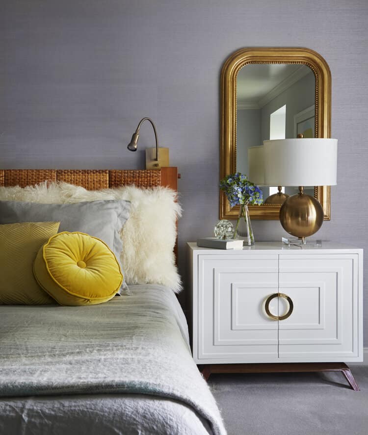
While both stand on their own as fundamental design elements, texture and layers are better together. For instance, consider thoughtfully layering accent carpets, revealing a different pop of pattern and weave under each one. Or, refresh your bookshelf decor by styling a texturized, artisan-crafted vase in front of cleanly framed artwork. These subtle, yet dynamic changes breathe life into a space, as true beauty lies beneath the layers.
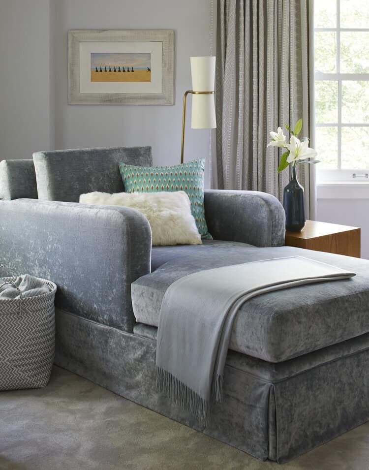
Tone on Tone
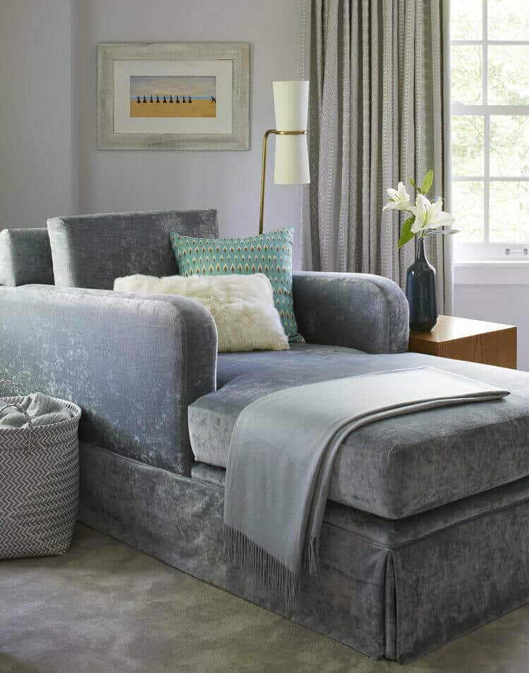
They say opposites attract, but sometimes two peas in a pod make the biggest impact. If the neutrals-lover in you is partial to just one color, consider showcasing its various tones as a way to add interest without busyness, especially when working with a smaller space. AKD design tip: if a large chair is interrupting the sightline to the other end of the room, upholster it in a similar tone to that of the room’s walls. Not only does this add a chic, layered element to the space, but also creates a light optical illusion resulting in the room appearing more spacious than it really is.
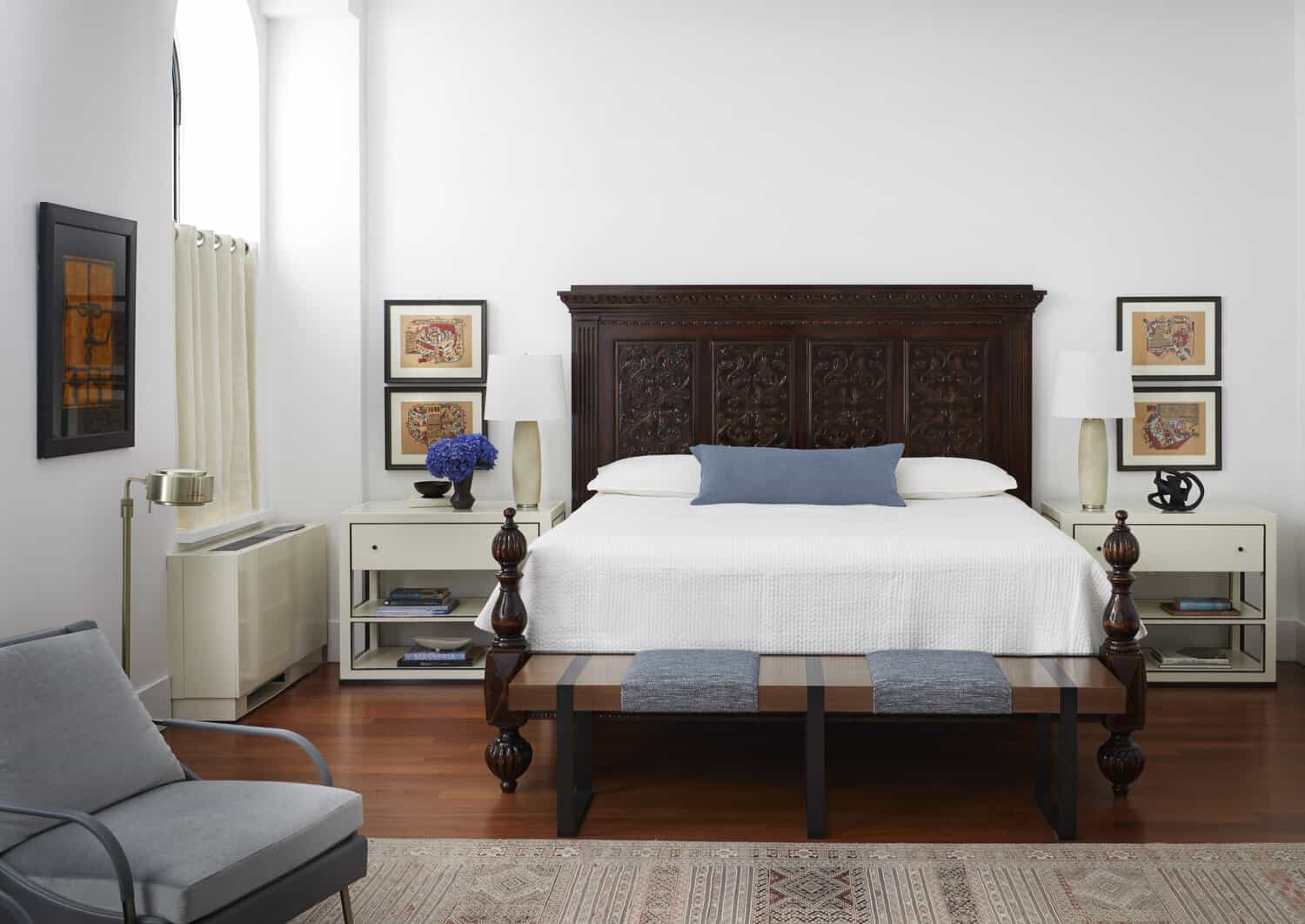
Old and New
While modern and vintage pieces each evoke an era of their own, used together they are a timeless pair. To bring some soul and personality to any space, incorporate your own favorite heirlooms into the design or scour markets for pieces that speak to you. In a room with sleek, simple lines, I love to flank a larger, anchoring piece with a matching pair of antique lamps. When displayed in tandem, old and new brings a storied and rich feeling to any space, but especially to new build spaces or homes that tend to lean a bit more modern.
amy kartheiser design
home
about
services
portfolio
press
contact
Copyright © 2026 Amy Kartheiser Design | Website design by the la.rue creative studio