
Creative Ways to Infuse Color Into Your Space
For the past decade, interior design has been dominated by shades of gray, white, and beige — and as lovely as neutrals can be, I couldn’t be happier to welcome more colorful furnishings, paint shades, textiles, and more. In 2025, my clients are requesting spaces that feel alive and personal, and color is one of the most impactful tools for creating mood and personality.
Here, I’m sharing ways my team and I use color to bring life and joy to the homes we design — and the ways you can do the same.
What’s the Value of Adding Color?
I’m so glad you asked! Neutrals often get all the credit for being “calming.” While that can certainly be true, I like to take a different approach. Joy and creativity can be created and provided through the right colorway, and both of those emotions bring energy — so when a homeowner is decompressing at home after a long day, a bold color scheme can enliven the senses and bring back some happiness and fulfillment.
In addition to the mood benefits, color also adds so much personality and individuality to a space. More and more, my clients are sharing that they’re tired of mass-produced products and design schemes that look the same as everyone else’s. Highly personal spaces make such an impact (design-wise and in terms of enjoyment and functionality!), and the creative use of color ensures that no two homes look the same.
Balancing Color with Negative Space
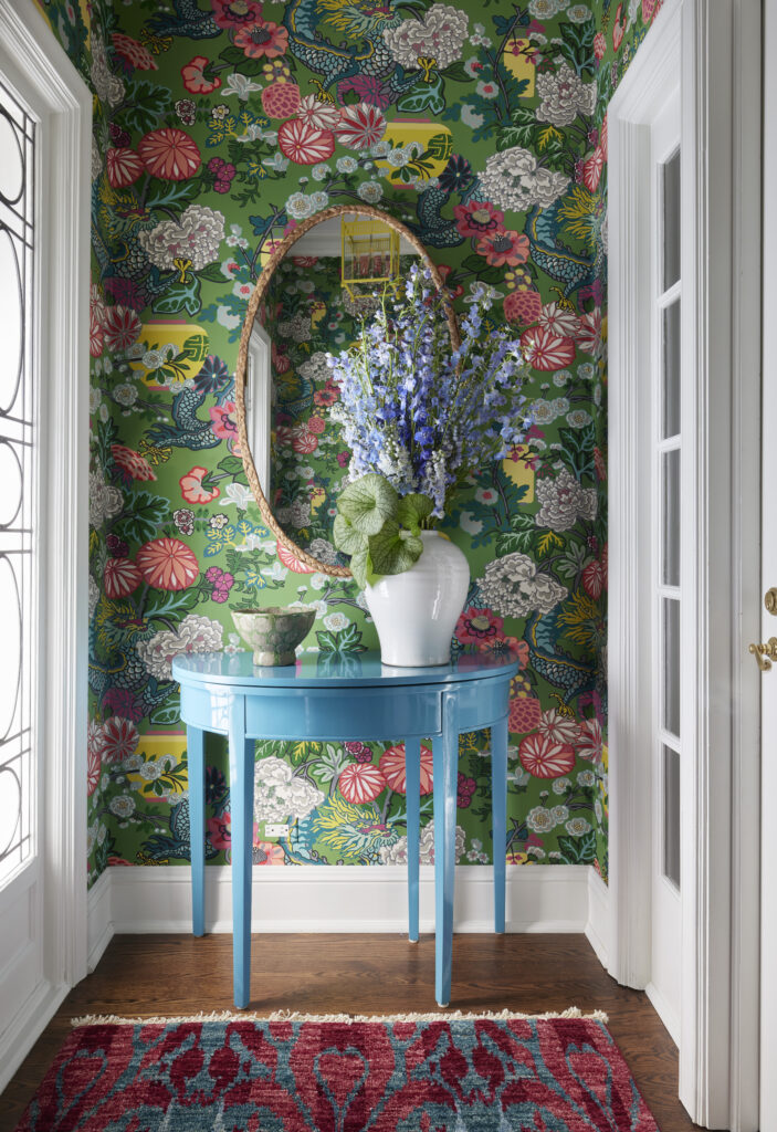
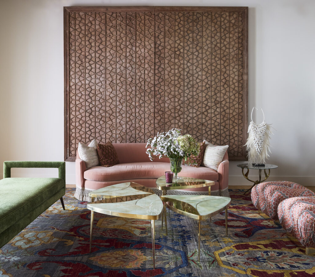
Now let’s get to it. Homeowners often think they want a neutral setting with “pops” of color — and while I’m happy to oblige if a client is set on this colorway, I like to steer them towards ways to infuse color in a bit bigger way. I love to utilize bright wallpaper, a bold-colored couch, or big, splashy artwork, but the key is to include negative space to balance it out. This can be implemented by adding warm wood against a saturated wall, utilizing matte next to gloss, or adding linen next to lacquer. While pops of color certainly have their place, I’d rather allow the color to really sing, then balance it out with neutrals — rather than the other way around.
Getting Creative
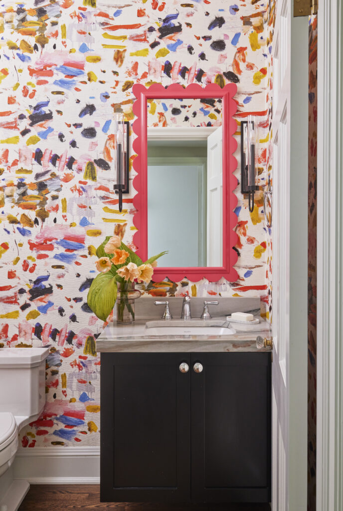
Wall coverings, artwork, and rugs are some of the most frequently requested ways clients like to infuse color, but I’m here to take things a step further. We’re currently working on a (very colorful!) home that will feature three different fully-gutted bathrooms. Each one features multiple colors in its individual wallpaper — but also in tile, marble, cabinetry, mirrors, and more. The blending of these colors, made even more interesting through texture, feels so dynamic, and it’s such a treat for the senses.
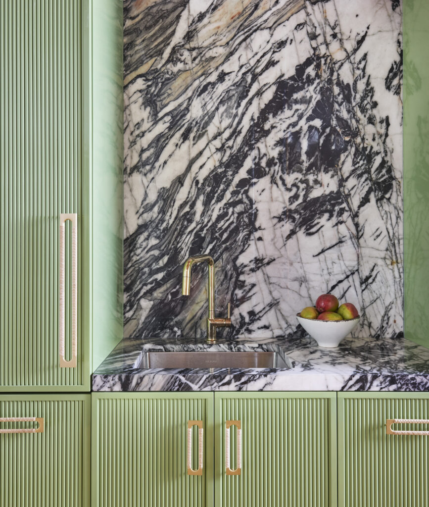
As in those bathrooms, other spaces can benefit from color in cabinetry. My own office features green storage spaces in the kitchen, and I love how that colorful concept can offset the materiality of appliances and the variability of marble.
Prioritizing Both Color and High Design
Neutrals are often regarded as the most luxurious of color schemes (“quiet luxury,” if you will), but so many of my favorite brands and vendors are creating colorful products and customizations at the absolute highest level. The key is to utilize colorful elements that are made with high-quality materials. For example, by using a bright mohair or colored marble, your space feels very layered. Cheaper materials will look cheap no matter what color they are, so I ensure that any colorful wall coverings, window treatments, textiles, and hard finishes are created with quality top of mind.
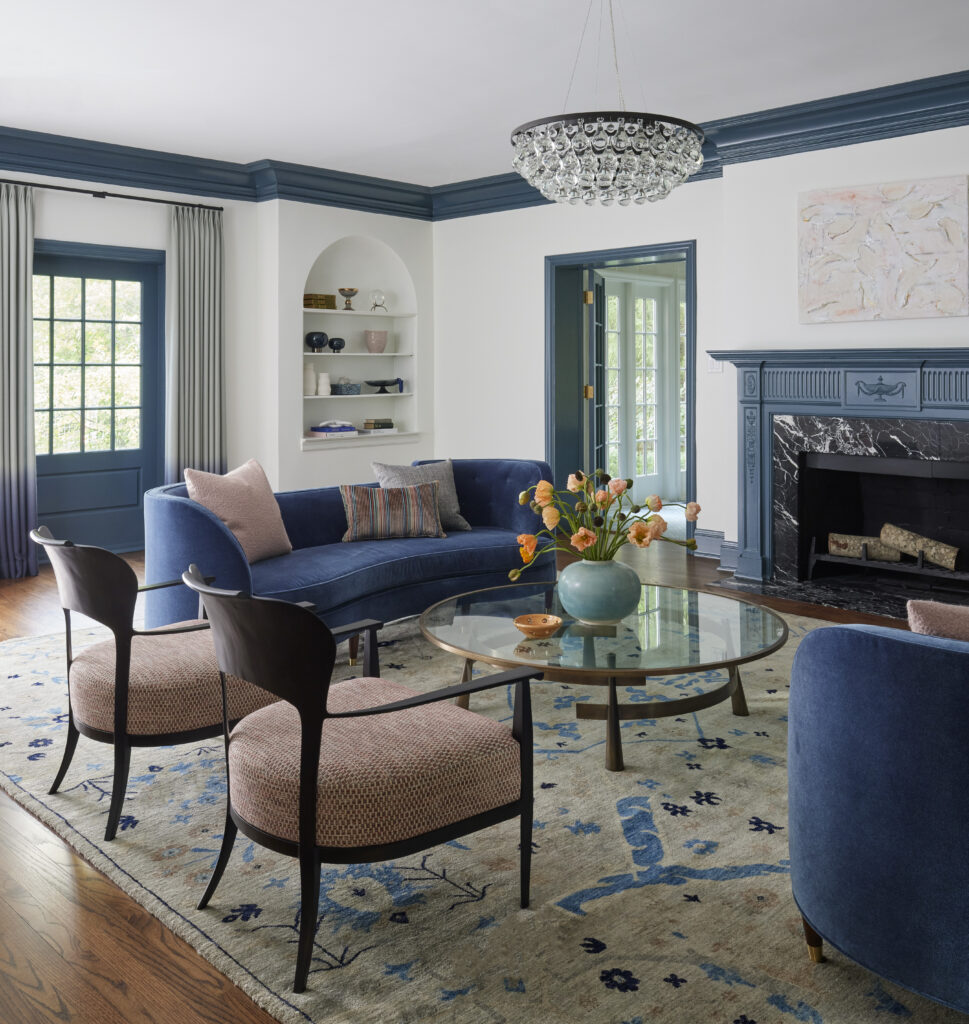
In addition to materiality, shape plays a lot into luxury. While a bright sofa could feel less refined, that effect is lost when the shape of the sofa is sculptural and artistic. This way, the color plays a supporting role to the form.
This truly is the secret — to let color tell the story of the space, versus letting the color be the story of the space.
What’s Next
I was recently inspired by a living room by Miles Redd featuring pink satin walls and a red velvet sofa. It’s completely bold, fearless, and unapologetic, and I love this color combination. One would think this high drama combination could be too much, but the red adds the perfect amount of strength to the femininity of the pink. I am all for this color combination… So, who’s ready to jump in with me?
To Continue Reading:
Going Bold: My Favorite Patterned Wallpapers and Bold Paint Colors

