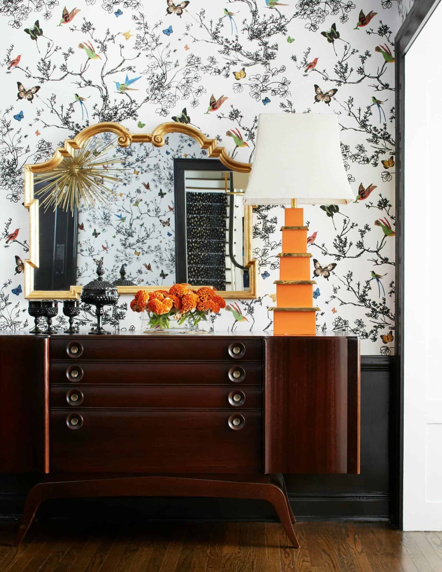
Design Touches You Should Take a Chance On
Do you find yourself “oohing” and “aahing” at beautiful wallpapers and bold prints while flipping through a glossy, but when it comes to actually deciding on the design details of your own home, you stick to what you know?
It’s easy to gravitate towards safe styles, but the out-of-the-box, unique touches that may feel a bit risky will end up being your favorite parts of your home – I see it time and time again!
Below, I’m sharing a few of my favorite design touches that can transform your home into a one-of-a-kind living space, infused with personality and style.
Step Outside of the Ordinary with Your Hardware Choices
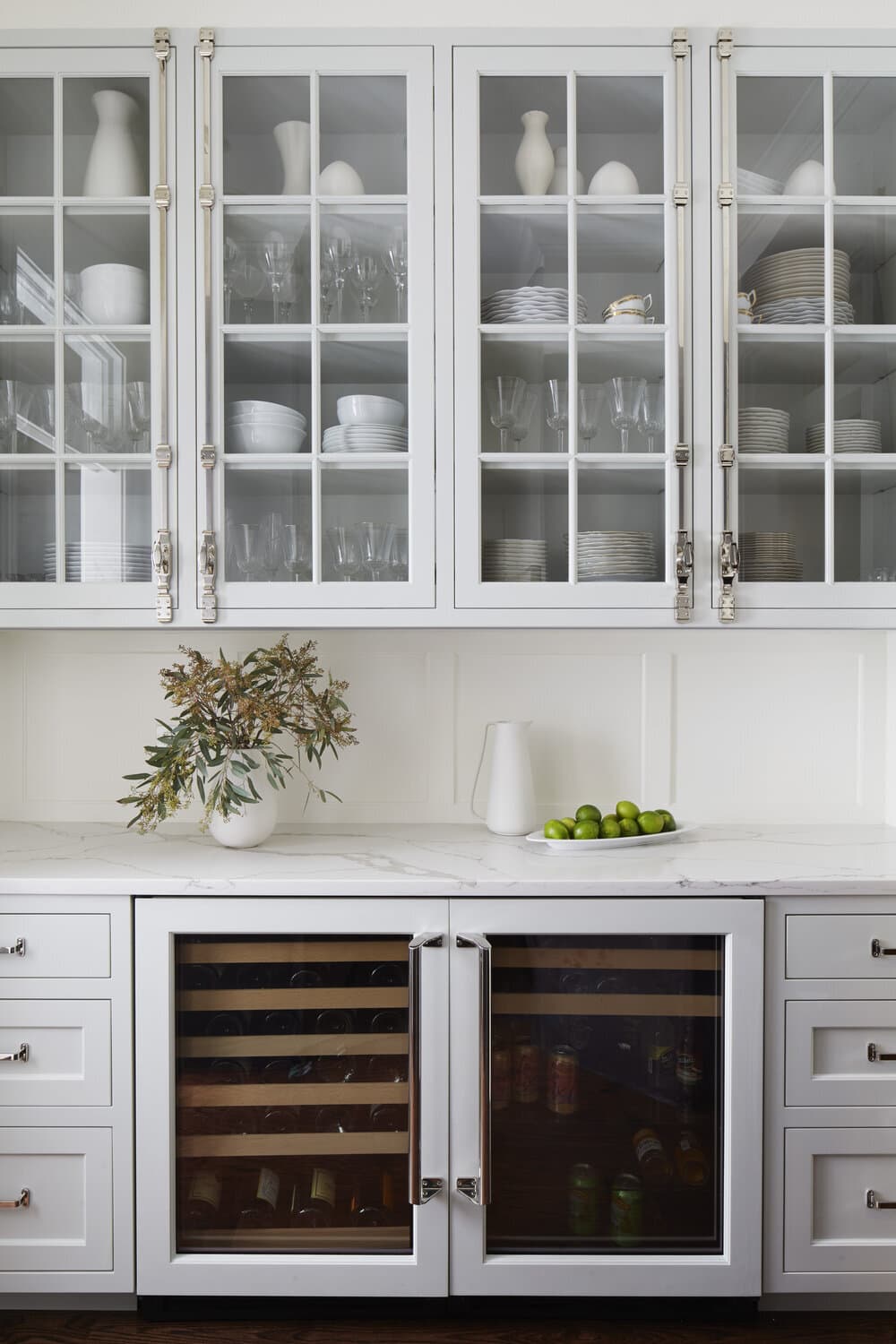
It’s no surprise hardware has been dubbed the “jewelry of the home” — it’s incredible how these small details can reflect the personality of your entire space, and just like adding a necklace to your outfit, upgrading your hardware can make all of the difference in completing a look.
For instance, try incorporating intrinsic knobs and artistic pulls — although they are less preferred for more the higher use areas of your home, they are perfect for cabinets and drawers that you don’t open and close multiple times a day.
Unlacquered brass is another one of my favorite options for hardware. I love the greens and browns that surface over time as a result of the oxidation process (commonly known as patina). Fun fact — the more you handle them, the more quickly the patina develops, giving you that natural and aged finish.

Try Out a Monochromatic Look
Tone-on-tone designs can make a significant, personality-infused impact without busy-ing a space with opposing colors. Some of the most jaw-dropping and memorable designs I’ve ever seen have stuck to one color, showcased in various tones. The result? A chic monochromatic look brimming with depth and interest.

Embrace Transformative Flooring
In larger spaces, selecting a neutral flooring is one of the smartest ways to bring in warmth without overpowering the design. But in smaller rooms, such as powder rooms or mud rooms, I often find the area screaming for a pop of color or interesting print. In these areas, you can have fun playing with tile layouts, colors, and materials — embrace the opportunity to do something different than the rest of your home, and go bold!
For common areas, or larger rooms that need a little touch of something extra, I am all about layering unique rugs to add depth and interest. First, be sure to match the undertones to avoid a duo that clashes, and from there, allow your personality to shine through with the print or color selections. The best part about layering rugs: nothing is permanent. I love to switch things up and move rugs around to different rooms, or test out different layered combinations.

Embrace the Endless Lighting Options
You probably know by now that lighting has a soft spot in my heart, so I will scream from the rooftops that bold lighting choices are always worth it. Incorporating lighting in new ways can make a dramatic impact and lead the eye around the room. Try utilizing wall-mounted sconces in place of a chandelier above a kitchen table, hanging pendants instead of your traditional sconces, or bringing in an art light over a bathroom mirror. I find that lighting is an impactful and exciting way to challenge design standards to really learn what your personal style is.
Never Pass Up an Art Piece That Speaks to You
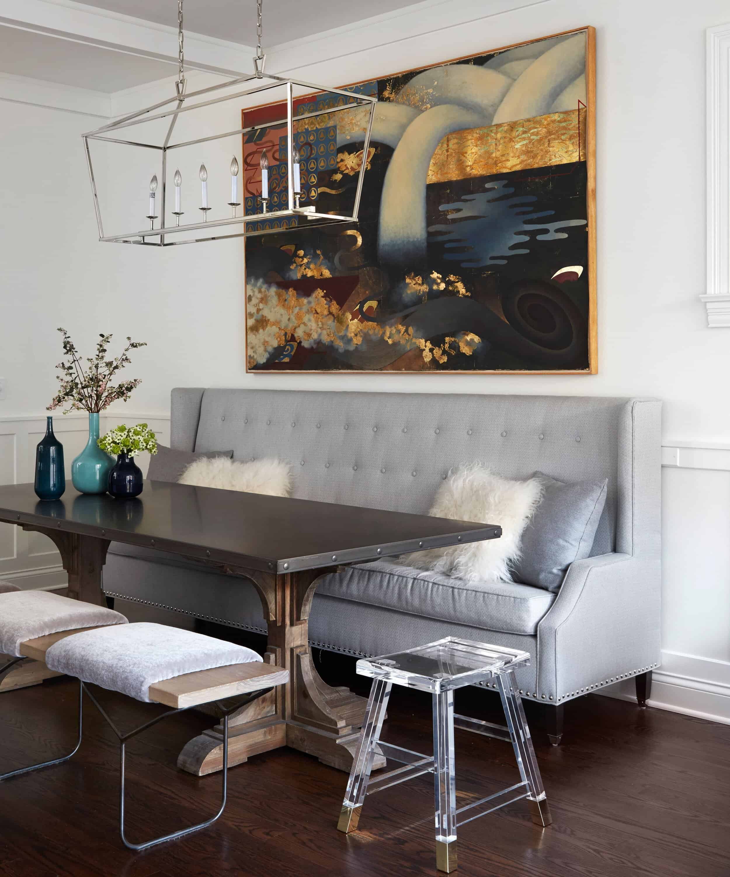
Selecting artwork for your home is such a personal process, but I am a firm believer that when you know, you’ll know. When you find yourself thinking about a piece of art hours after it first caught your eye, it belongs in your home. While scale, color and style are important considerations for a work of art, the priority is the feeling you get when you walk past it — and nothing makes a better statement than that.
Make the Move on a Striking Statement Wall
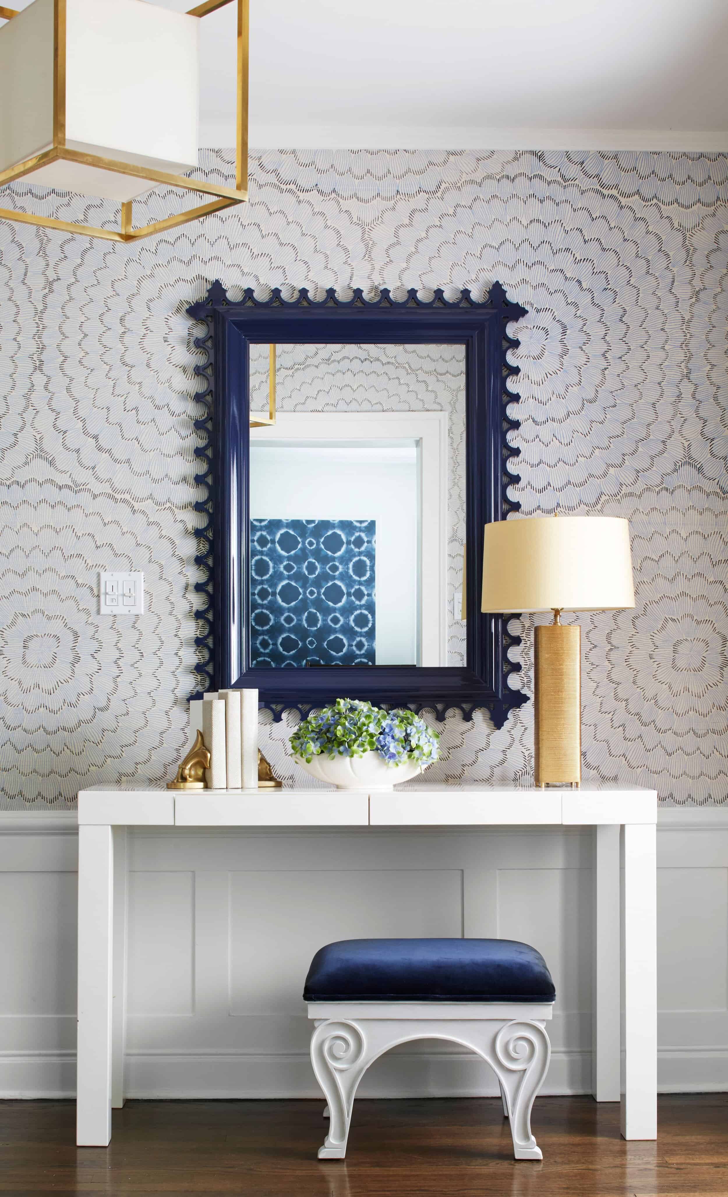
While I love to play with bold wallpapers or paint colors, I know that isn’t always for everyone – but that’s not to say your walls can’t pop with personality in a more neutral or subdued way.
Take a step back from playful prints that run from wall-to-wall and try incorporating stand-out millwork that adds character and charm to your room. Or, if you love print in moderation, try incorporating a piece of hand-painted wallpaper in a frame, to add just the right amount of pattern or color to a room.
Elevate Your Walls with Statement-Worthy Trim
To elevate your neutral walls in a unique way, take a chance on dark, contrasting colors for the window trim. This combination can add so much character to your room without captivating the sole focus of the space.
Another way to make your molding pop is to paint it an alternative finish from your walls. For example, keep your walls a beautiful matte and add a glossy sheen to your trim for a subtle yet statement-worthy contrast. It’s all in the details, my friends.
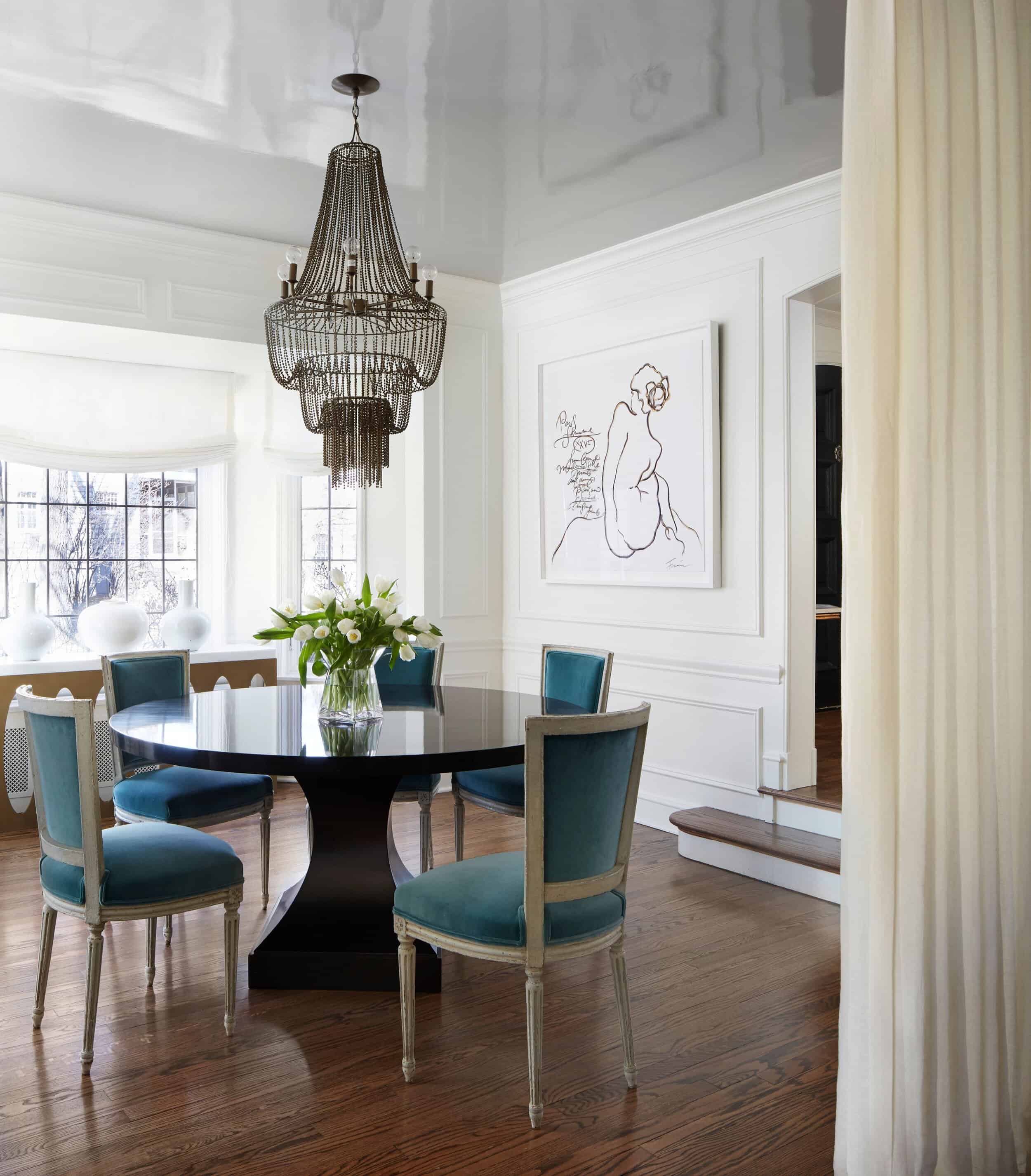
Go Big with a Memorable Ceiling
Did you think I’d go this whole blog post without turning my attention towards the ceiling? Not a chance. Playing with color or finish (even subtle contrast!) is one of my biggest design secrets when working with AKD clients. Elevate standard, white ceilings with a lacquered paint and you won’t believe the transformation it creates on your space.
amy kartheiser design
home
about
services
portfolio
press
contact
Copyright © 2026 Amy Kartheiser Design | Website design by the la.rue creative studio