Blue’s the Hue: A Peek Into My Latest Project
I’m not typically one to embrace feeling blue… but when it came to this stunning project on the North Shore, there was nothing typical about it. The busy family inhabiting this beautiful home was looking to feel both calm and energized — leaving me with no choice but to infuse each room with a heavy dose of one of nature’s most versatile colors: my tried-and-true blue!
Here, I’m taking you through the thought process I had when designing this space, from initial conception to the final, grand result.
A Bit About the Project
The AKD Textured and Tailored Estate (which was featured here in LUXE!) provided the opportunity to embrace beautifully detailed existing architecture while adding the vibrant personalities of the homeowners’ busy family — which includes three young, energetic sons! The couple was looking to curate a space that felt comfortable enough for family time, yet soothing enough to serve as a respite from the bustling outside world and their seemingly never-ending to-do lists. Knowing the couple’s inclination towards blue, adding it to the space in thoughtful ways felt like an obvious choice!
A Love Letter to Blue
Like I said, these homeowners were drawn to the color blue — and they’re certainly not alone. Blue is the most popular color choice for about 70% of our clients, and it’s easy to see why. Not only does a blue palette feature endless opportunity for customization, it’s also a scientifically-backed shade to use in the home. Basically, because of its short wavelengths, blue absorbs all other colors in a light source — so blue always truly shows as blue, because all the other colors that could hit it get absorbed. That is what makes it such a powerful color in design. It’s at once vibrant and calming (just like the client’s vision!).
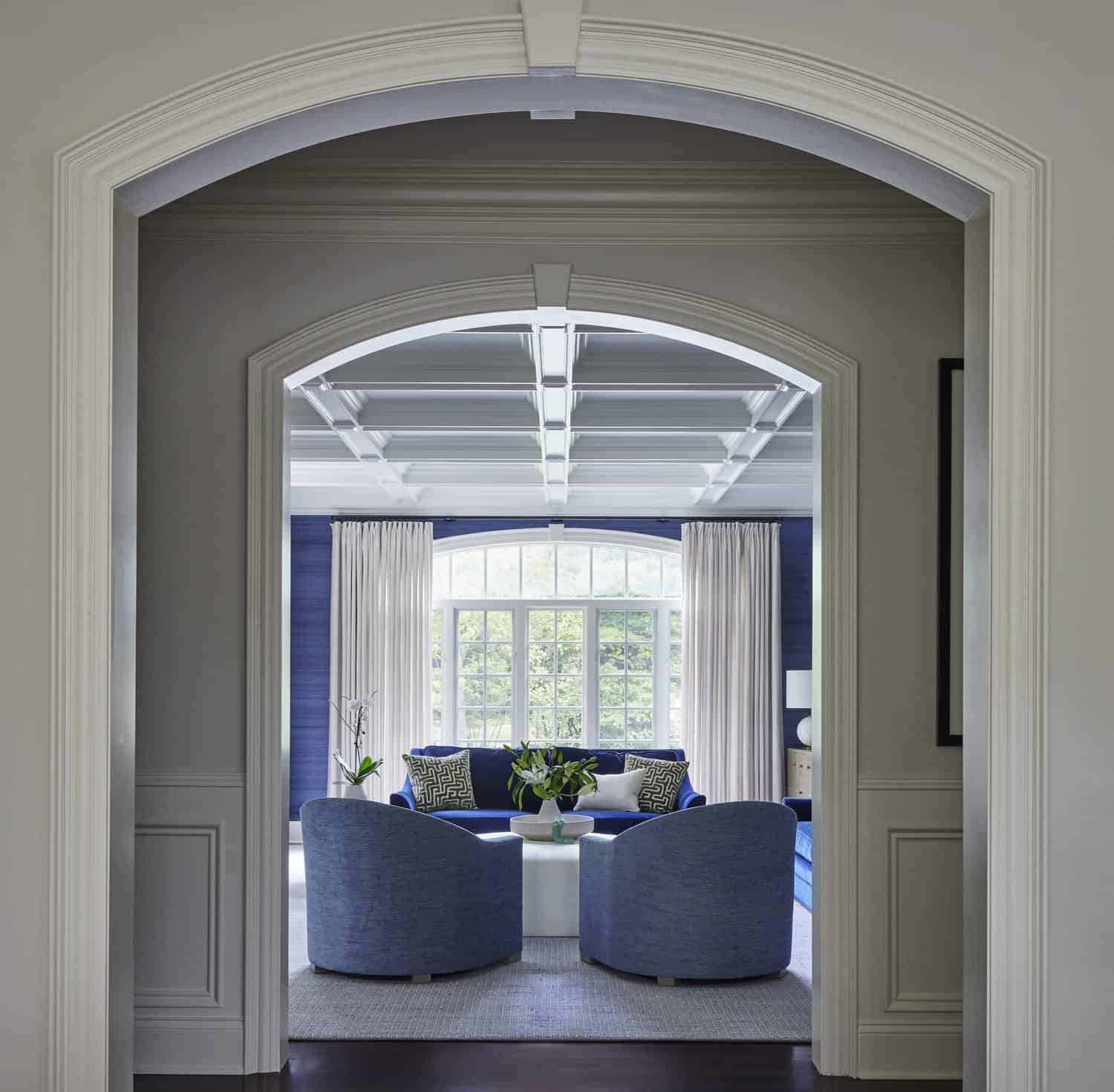
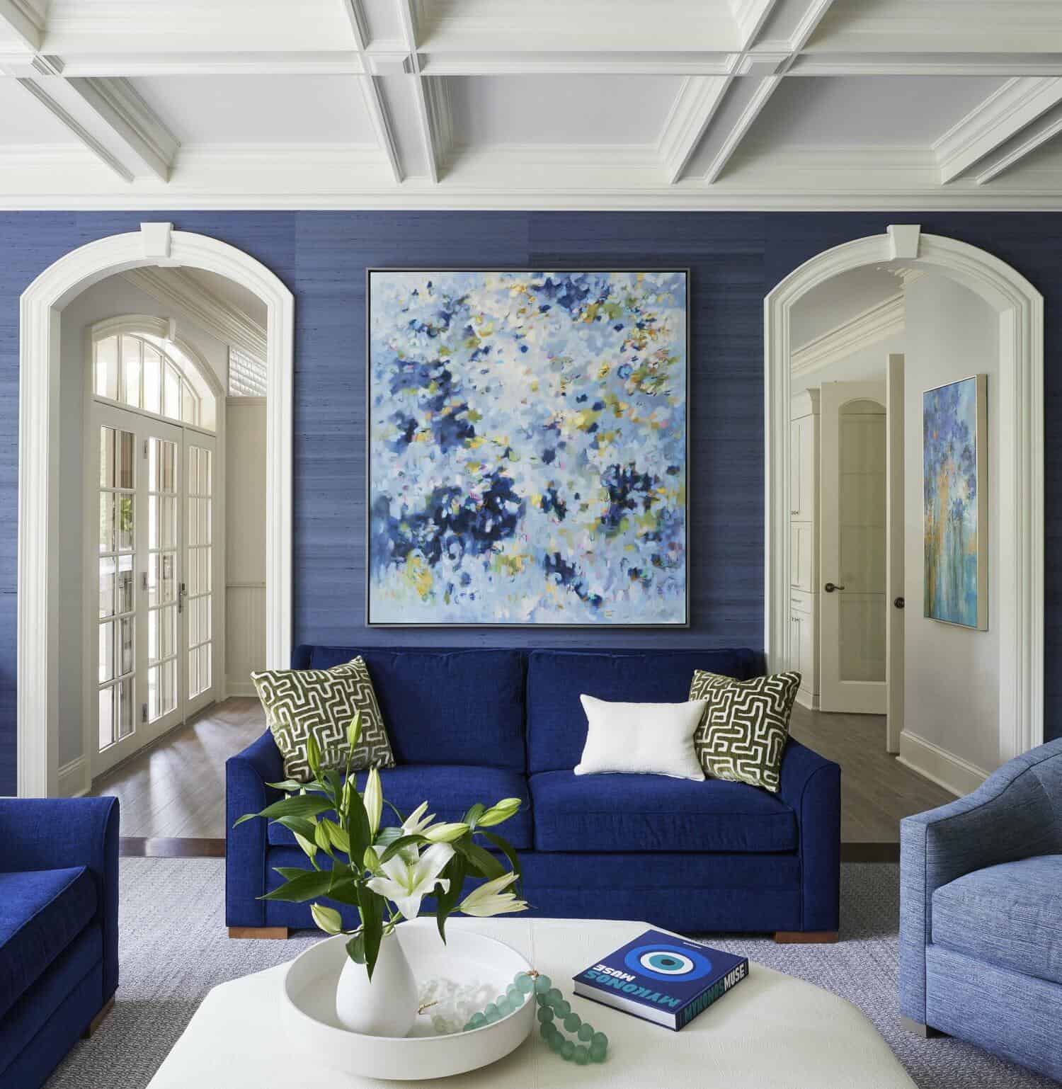
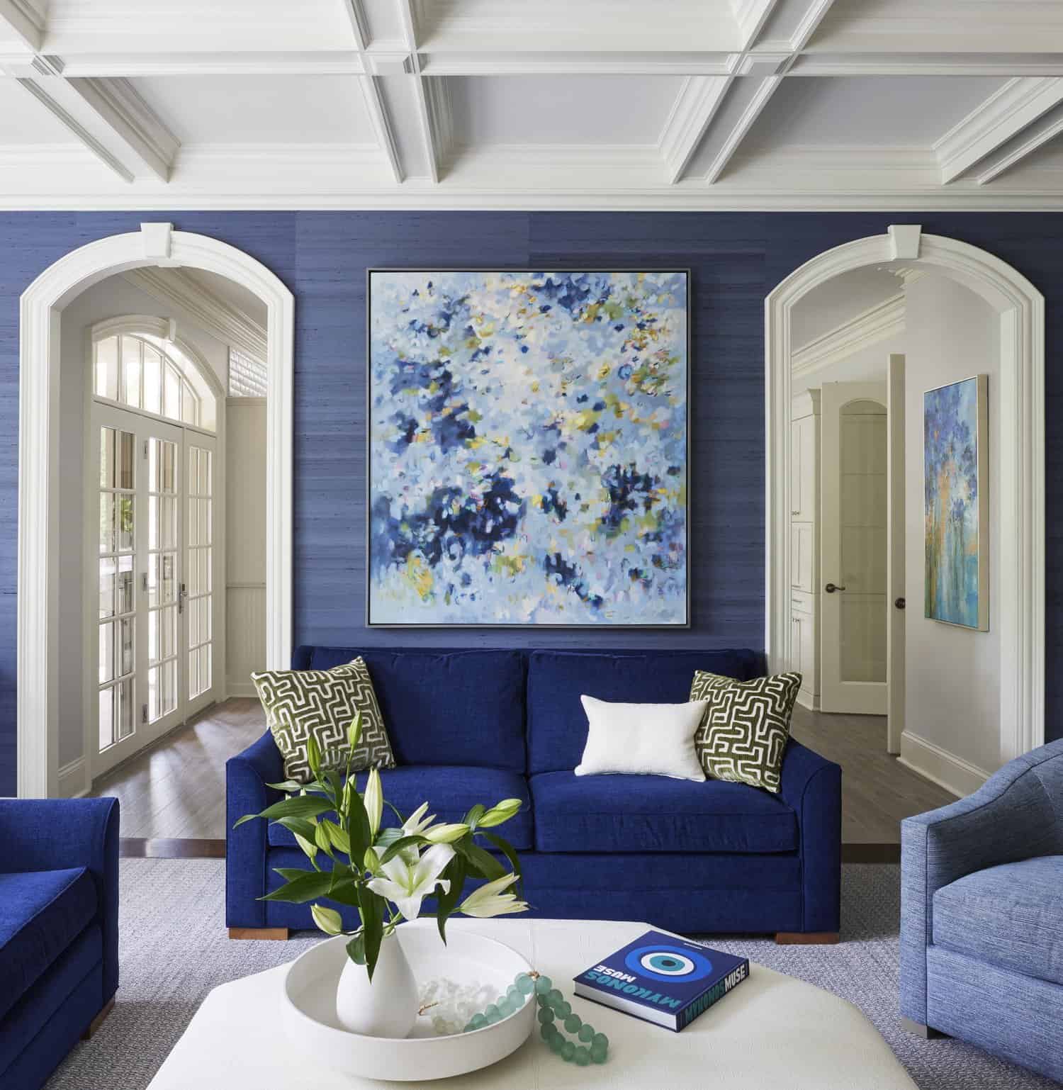
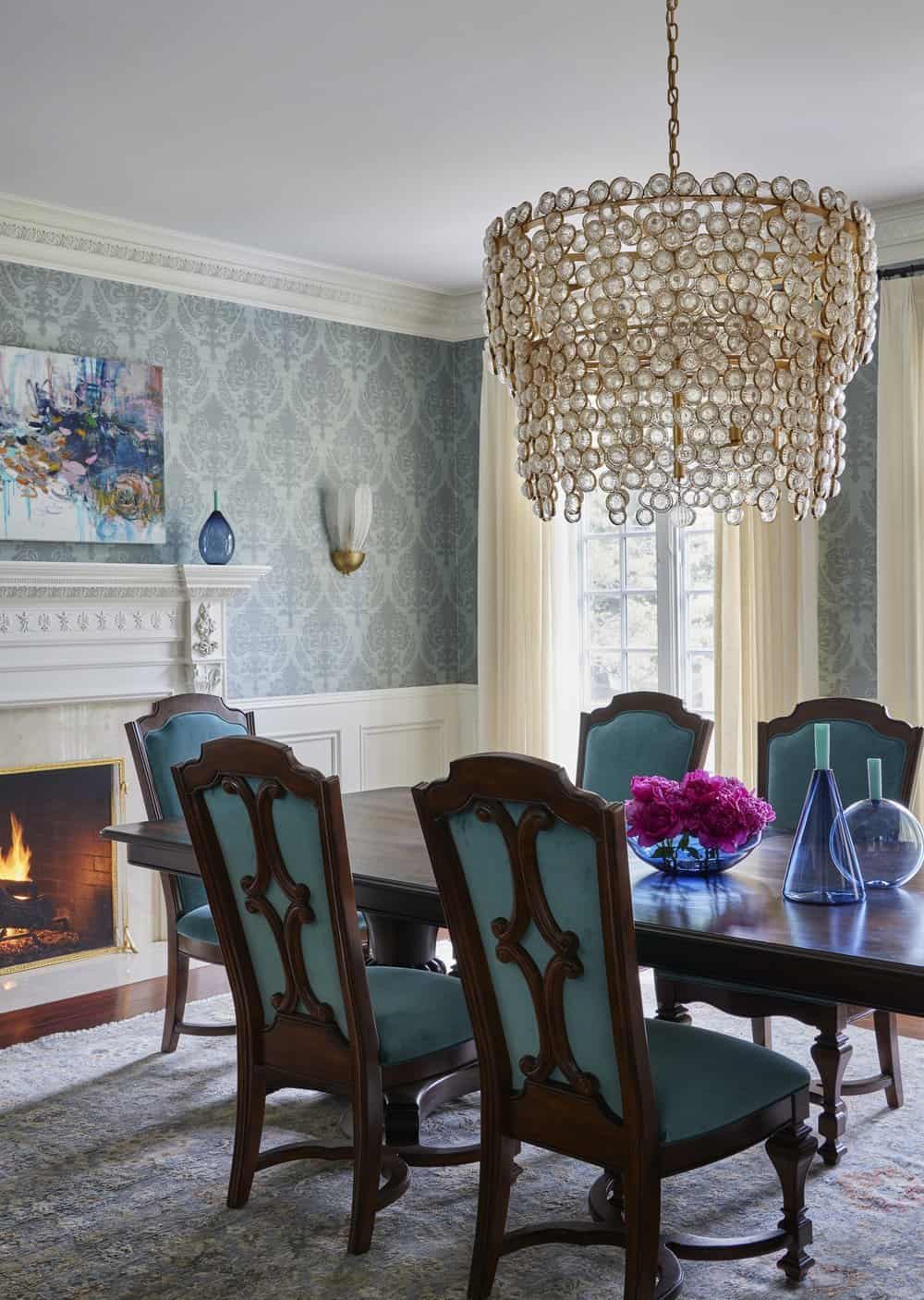
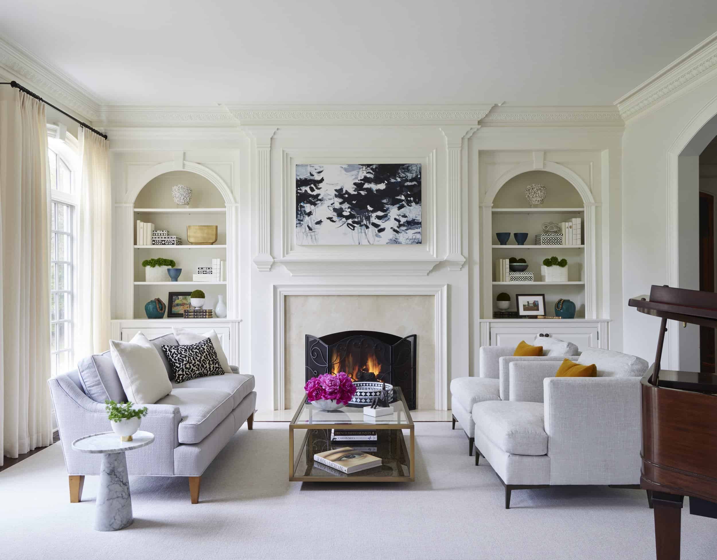
The Overall Color Story: Elements Big and Small
Once we knew we wanted to add shades of blue to just about every room in the house, the fun part could truly begin. While the homeowners love the color, I didn’t want to overwhelm the design.
This led us to get creative, sourcing pieces with faint hints of blue in juxtaposition to rooms dominated by a jewel-toned shade. Tone-on-tone is one of my favorite design elements, and this home allowed so much opportunity! Thankfully, there are so many different variations of blue, so we certainly weren’t afraid of running out of complementary shades.
In addition to these varying tones, we also took the opportunity to play with textures and finishes to add dimension and depth. Even in a room that featured such bold, dramatic shades of blue, the result was still cozy thanks to the comfortable, grounding textures we chose. When choosing how much of the color to add to a room, we took the room’s purpose and goal into consideration, allowing that to speak to our final choices.
How to Incorporate Blue Into Your Own Space
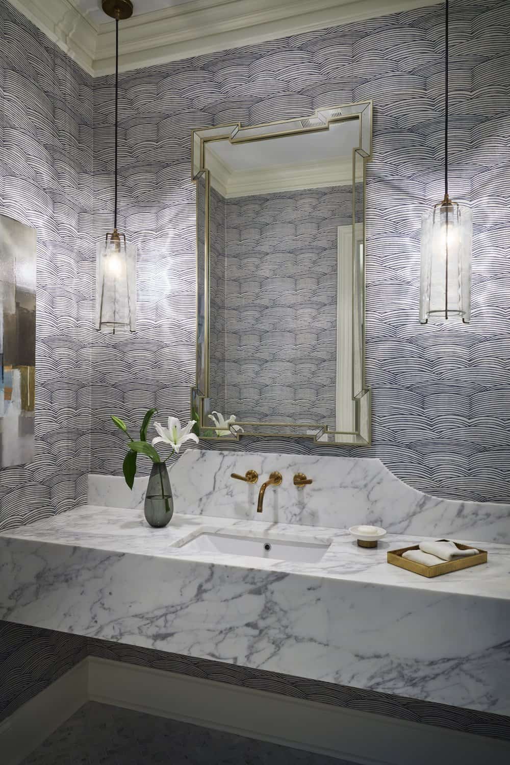
As always, start small! Purchase art with splashes of shade, or invest in a few decorative pillows. Once you begin to notice how different hues make you feel, begin incorporating them into different rooms. (For more on creating your own color story in your space, check out this post!) As you’ll see in this home, it was important for us to add colors only when they improved upon the existing finishes and architecture — with flowing, oceanic blue adding dimension to bathroom marble or rich, bright blue being highlighted by ample natural light from large windows. Look at the room, process how you’d like to feel, then get started — in your own space, you can’t go wrong!

